Produces an abundance vs time diagram.
Usage
# S4 method for class 'IncrementTest,missing'
plot(
  x,
  calendar = get_calendar(),
  col.neutral = "#004488",
  col.selection = "#BB5566",
  col.roll = "grey",
  flip = FALSE,
  ncol = NULL,
  xlab = NULL,
  ylab = NULL,
  main = NULL,
  sub = NULL,
  ann = graphics::par("ann"),
  axes = TRUE,
  frame.plot = axes,
  ...
)
Arguments
- x
An
IncrementTestobject to be plotted.- calendar
An
aion::TimeScaleobject specifying the target calendar (seeaion::calendar()).- col.neutral, col.selection, col.roll
A vector of colors.
- flip
A
logicalscalar: should the y-axis (ticks and numbering) be flipped from side 2 (left) to 4 (right) from series to series whenfacetis "multiple"?- ncol
An
integerspecifying the number of columns to use whenfacetis "multiple". Defaults to 1 for up to 4 series, otherwise to 2.- xlab, ylab
A
charactervector giving the x and y axis labels.- main
A
characterstring giving a main title for the plot.- sub
A
characterstring giving a subtitle for the plot.- ann
A
logicalscalar: should the default annotation (title and x and y axis labels) appear on the plot?- axes
A
logicalscalar: should axes be drawn on the plot?- frame.plot
A
logicalscalar: should a box be drawn around the plot?- ...
Further parameters to be passed to
panel(e.g. graphical parameters).
Value
plot() is called it for its side-effects: it results in a graphic being
displayed (invisibly returns x).
Details
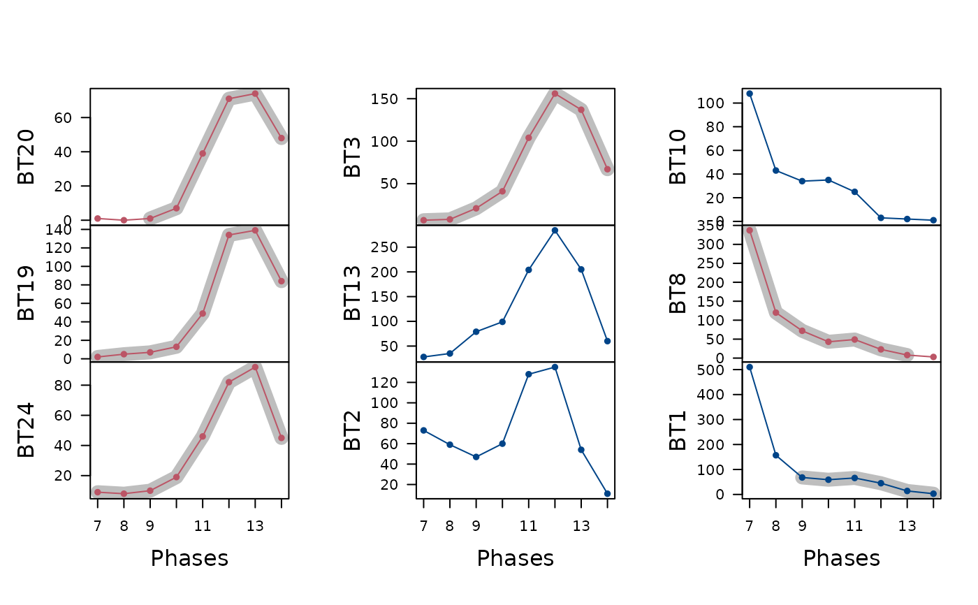
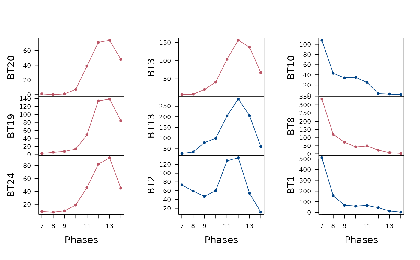
Results of the frequency increment test can be displayed on an abundance
vs time diagram aid in the detection and quantification of selective
processes in the archaeological record. If roll is TRUE, each time
series is subsetted according to window to see if episodes of selection
can be identified among decoration types that might not show overall
selection. If so, shading highlights the data points where
fit() identifies selection.
Note
Displaying FIT results on an abundance vs time diagram is adapted from Ben Marwick's original idea.
See also
Other plotting methods:
plot.AoristicSum(),
plot.EventDate(),
plot.MeanDate(),
plot_time()
Examples
## Data from Crema et al. 2016
data("merzbach", package = "folio")

## Keep only decoration types that have a maximum frequency of at least 50
keep <- apply(X = merzbach, MARGIN = 2, FUN = function(x) max(x) >= 50)
counts <- merzbach[, keep]

## Group by phase
## We use the row names as time coordinates (roman numerals)
dates <- as.numeric(utils::as.roman(rownames(counts)))

## Frequency Increment Test
freq <- fit(counts, dates, calendar = NULL)

## Plot time vs abundance
plot(freq, calendar = NULL, ncol = 3, xlab = "Phases")


## Plot time vs abundance and highlight selection
freq <- fit(counts, dates, calendar = NULL, roll = TRUE, window = 5)
plot(freq, calendar = NULL, ncol = 3, xlab = "Phases")
## Plot time vs abundance and highlight selection
freq <- fit(counts, dates, calendar = NULL, roll = TRUE, window = 5)
plot(freq, calendar = NULL, ncol = 3, xlab = "Phases")