Plots a Bertin diagram.
Usage
plot_bertin(object, ...)

# S4 method for class 'matrix'
plot_bertin(
  object,
  threshold = NULL,
  freq = FALSE,
  margin = 1,
  color = c("white", "black"),
  flip = TRUE,
  axes = TRUE,
  ...
)

# S4 method for class 'data.frame'
plot_bertin(
  object,
  threshold = NULL,
  freq = FALSE,
  margin = 1,
  color = c("white", "black"),
  flip = TRUE,
  axes = TRUE,
  ...
)
Arguments
- object
A \(m \times p\)
numericmatrixordata.frameof count data (absolute frequencies giving the number of individuals for each category, i.e. a contingency table).- ...
Currently not used.
- threshold
A
functionthat takes a numeric vector as argument and returns a numeric threshold value (see below). IfNULL(the default), no threshold is computed. Only used iffreqisFALSE.- freq
A
logicalscalar indicating whether conditional proportions givenmarginsshould be used (i.e. entries ofobject, divided by the appropriate marginal sums).- margin
An
integervector giving the margins to split by:1indicates individuals/rows (the default),2indicates variables/columns. Only used iffreqisTRUE.- color
A vector of colors or a
functionthat when called with a single argument (an integer specifying the number of colors) returns a vector of colors.- flip
A
logicalscalar: shouldxandyaxis be flipped? Defaults toTRUE.- axes
A
logicalscalar: should axes be drawn on the plot? It will omit labels where they would abut or overlap previously drawn labels.
Value
plot_bertin() is called for its side-effects: it results in a graphic
being displayed (invisibly returns object).
Details
As de Falguerolles et al. (1997) points out: "In abstract terms, a Bertin matrix is a matrix of displays. [...] To fix ideas, think of a data matrix, variable by case, with real valued variables. For each variable, draw a bar chart of variable value by case. High-light all bars representing a value above some sample threshold for that variable."
References
Bertin, J. (1977). La graphique et le traitement graphique de l'information. Paris: Flammarion. Nouvelle Bibliothèque Scientifique.
de Falguerolles, A., Friedrich, F. & Sawitzki, G. (1997). A Tribute to J. Bertin's Graphical Data Analysis. In W. Badilla & F. Faulbaum (eds.), SoftStat '97: Advances in Statistical Software 6. Stuttgart: Lucius & Lucius, p. 11-20.
See also
Other plot methods:
matrigraph(),
plot_diceleraas(),
plot_ford(),
plot_heatmap(),
plot_rank(),
plot_spot(),
seriograph()
Examples
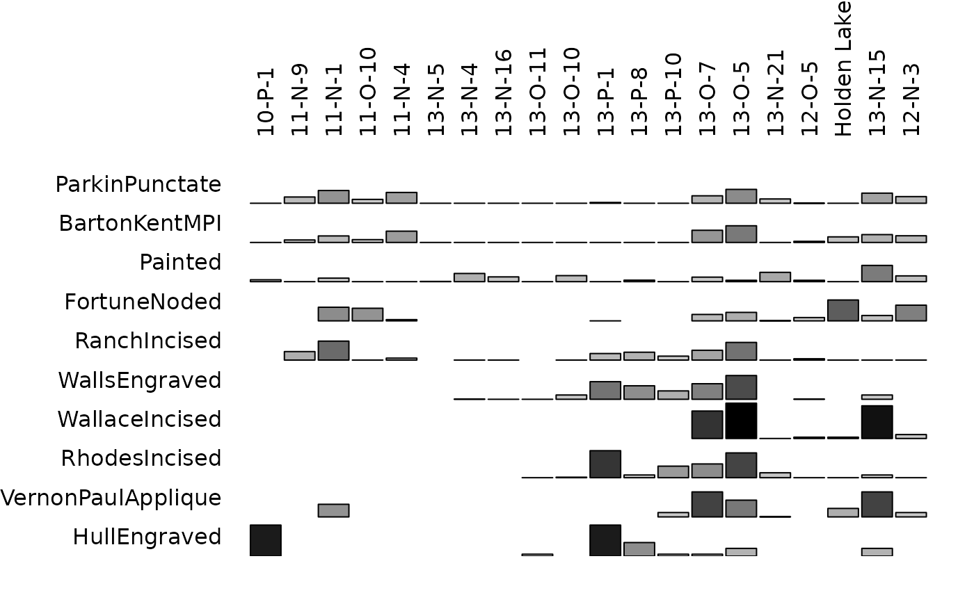
## Data from Lipo et al. 2015
data("mississippi", package = "folio")
## Plot a Bertin diagram...
## ...without threshold
plot_bertin(mississippi)
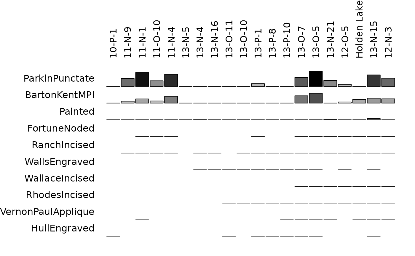 ## ...with the variable mean as threshold
plot_bertin(mississippi, threshold = mean)
## ...with the variable mean as threshold
plot_bertin(mississippi, threshold = mean)
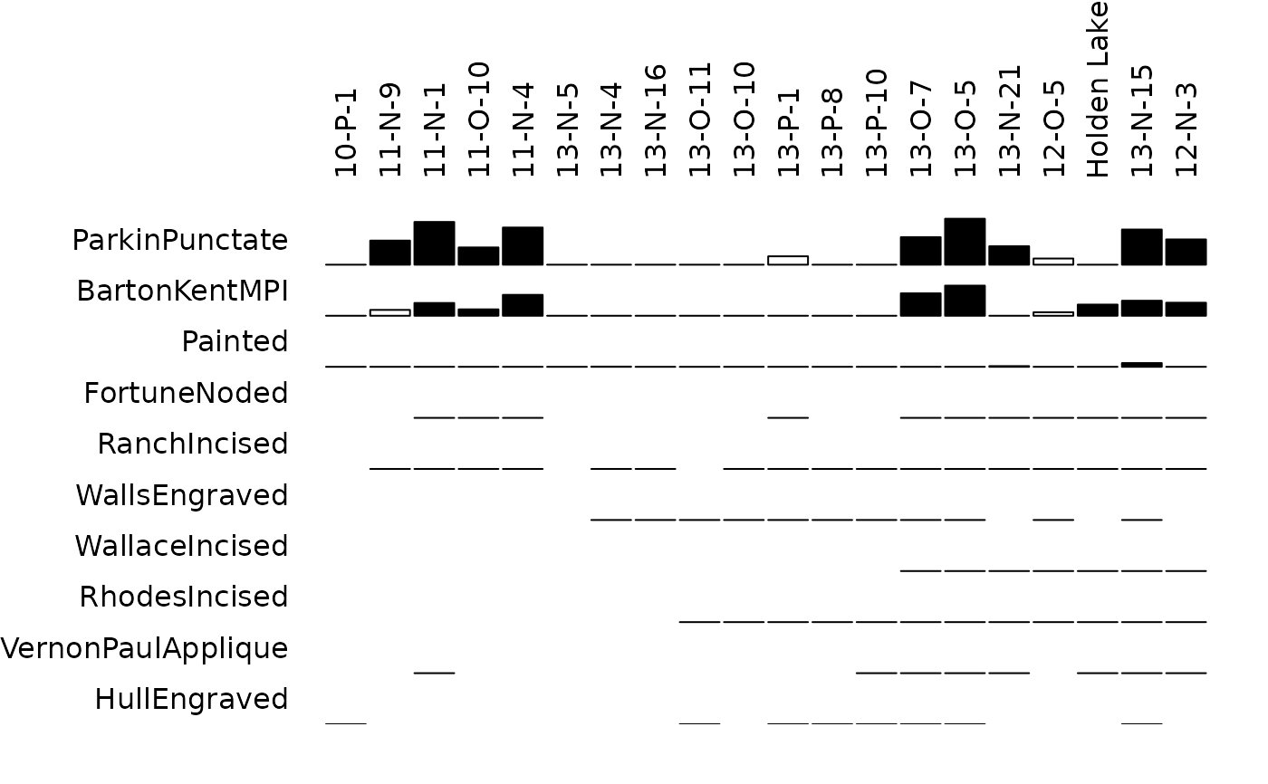 ## Plot conditional proportions
plot_bertin(mississippi, freq = TRUE, margin = 1)
## Plot conditional proportions
plot_bertin(mississippi, freq = TRUE, margin = 1)
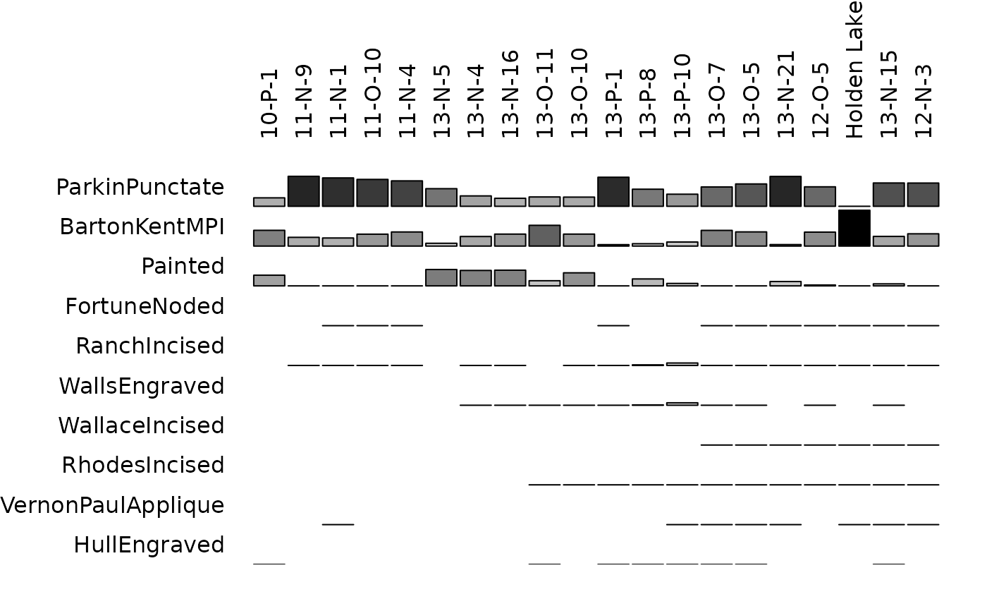 plot_bertin(mississippi, freq = TRUE, margin = 2)