Plots a Ford (battleship curve) diagram.
Usage
plot_ford(object, ...)

# S4 method for class 'matrix'
plot_ford(
  object,
  weights = FALSE,
  EPPM = FALSE,
  fill = "darkgrey",
  border = NA,
  axes = TRUE,
  ...
)

# S4 method for class 'data.frame'
plot_ford(
  object,
  weights = FALSE,
  EPPM = FALSE,
  fill = "darkgrey",
  border = NA,
  axes = TRUE,
  ...
)
Arguments
- object
A \(m \times p\)
numericmatrixordata.frameof count data (absolute frequencies giving the number of individuals for each category, i.e. a contingency table).- ...
Currently not used.
- weights
A
logicalscalar: should the row sums be displayed?- EPPM
A
logicalscalar: should the EPPM be drawn? Seeseriograph().- fill
The color for filling the bars.
- border
The color to draw the borders.
- axes
A
logicalscalar: should axes be drawn on the plot? It will omit labels where they would abut or overlap previously drawn labels.
Value
plot_ford() is called for its side-effects: it results in a graphic
being displayed (invisibly returns object).
References
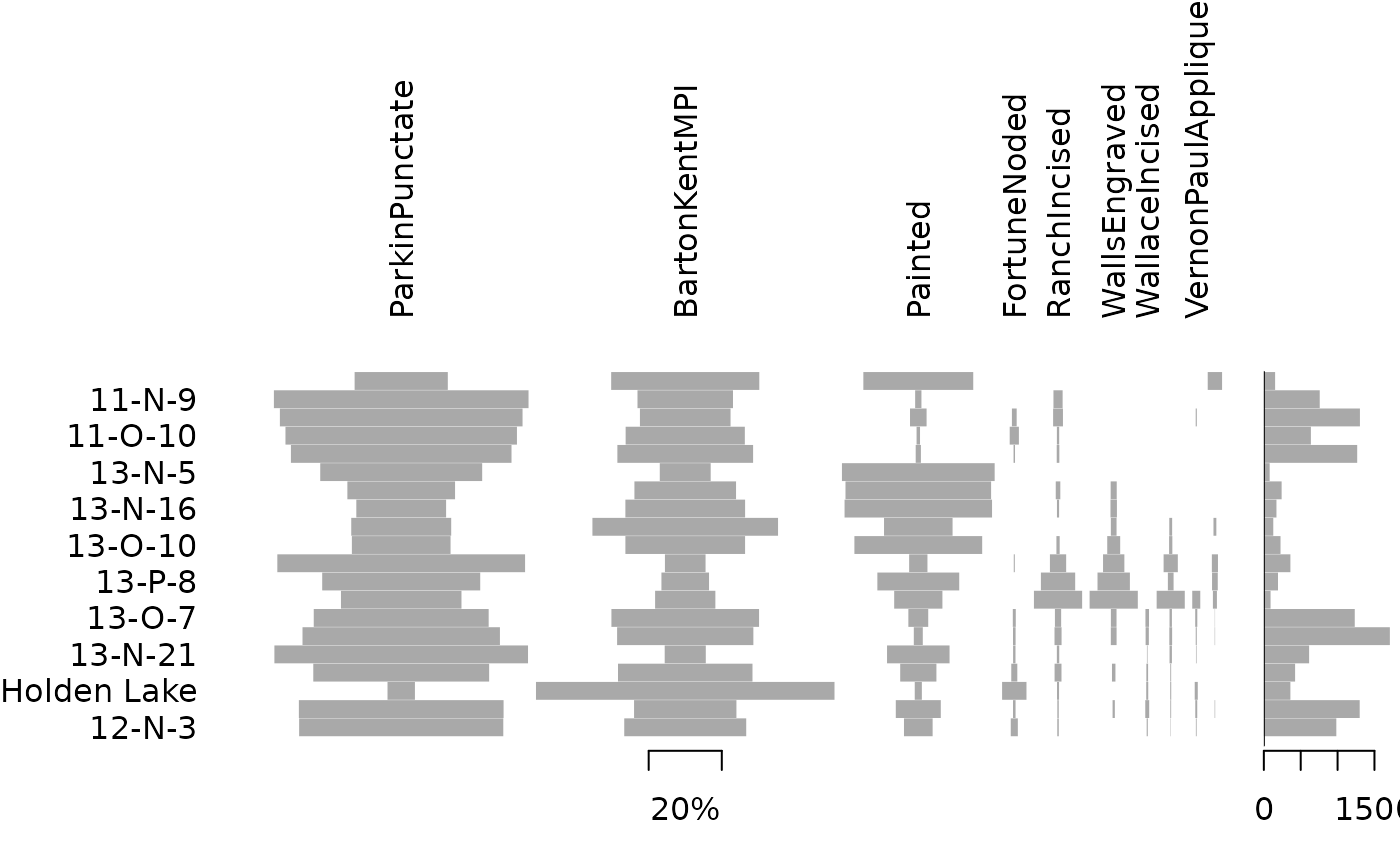
Ford, J. A. (1962). A quantitative method for deriving cultural chronology. Washington, DC: Pan American Union. Technical manual 1.
See also
Other plot methods:
matrigraph(),
plot_bertin(),
plot_diceleraas(),
plot_heatmap(),
plot_rank(),
plot_spot(),
seriograph()
Examples
## Data from Lipo et al. 2015
data("mississippi", package = "folio")
## Plot a Ford diagram
plot_ford(mississippi)
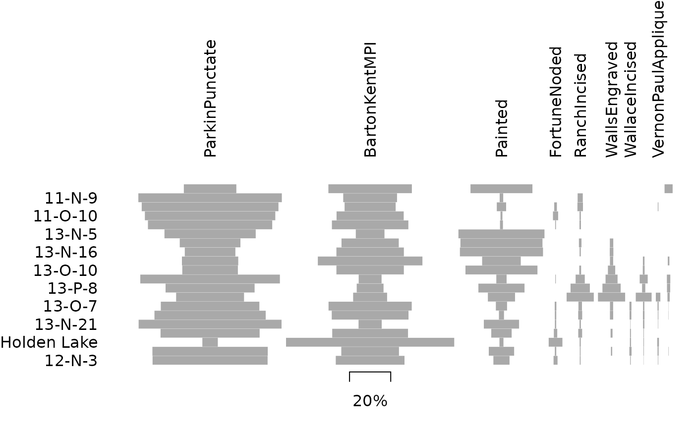 plot_ford(mississippi, weights = TRUE)