Plots a Dice-Leraas diagram.
Usage
plot_diceleraas(object, ...)

# S4 method for class 'matrix'
plot_diceleraas(
  object,
  main = NULL,
  sub = NULL,
  ann = graphics::par("ann"),
  axes = TRUE,
  frame.plot = FALSE,
  panel.first = NULL,
  panel.last = NULL,
  ...
)

# S4 method for class 'data.frame'
plot_diceleraas(
  object,
  main = NULL,
  sub = NULL,
  ann = graphics::par("ann"),
  axes = TRUE,
  frame.plot = FALSE,
  panel.first = NULL,
  panel.last = NULL,
  ...
)
Arguments
- object
A \(m \times p\)
numericmatrixordata.frameof count data (absolute frequencies giving the number of individuals for each category, i.e. a contingency table). Adata.framewill be coerced to anumericmatrixviadata.matrix().- ...
Further graphical parameters.
- main
A
characterstring giving a main title for the plot.- sub
A
characterstring giving a subtitle for the plot.- ann
A
logicalscalar: should the default annotation (title and x, y and z axis labels) appear on the plot?- axes
A
logicalscalar: should axes be drawn on the plot?- frame.plot
A
logicalscalar: should a box be drawn around the plot?- panel.first
An an
expressionto be evaluated after the plot axes are set up but before any plotting takes place. This can be useful for drawing background grids.- panel.last
An
expressionto be evaluated after plotting has taken place but before the axes, title and box are added.
Value
plot_diceleraas() is called for its side-effects: it results in a
graphic being displayed (invisibly returns object).
Details
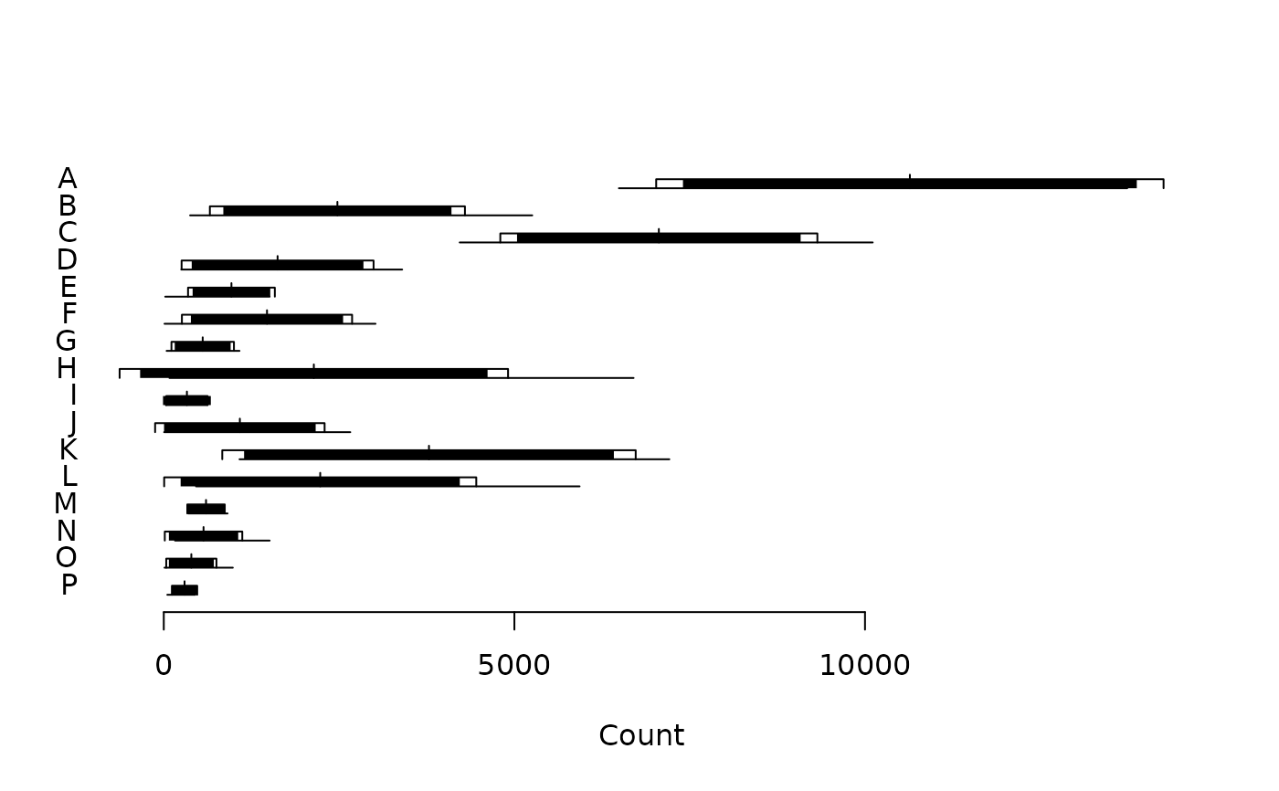
In a Dice-Leraas diagram, the horizontal line represents the range of data (min-max) and the small vertical line indicates the mean. The black rectangle is twice the standard error on the mean, while the white rectangle is one standard deviation on either side of the mean.
References
Dice, L. R., & Leraas, H. J. (1936). A Graphic Method for Comparing Several Sets of Measurements. Contributions from the Laboratory of Vertebrate Genetics, 3: 1-3.
Hubbs, C. L., & C. Hubbs (1953). An Improved Graphical Analysis and Comparison of Series of Samples. Systematic Biology, 2(2): 49-56. doi:10.2307/sysbio/2.2.49 .
Simpson, G. G., Roe, A., & Lewontin, R. C. Quantitative Zoology. New York: Harcourt, Brace and Company, 1960.
See also
Other plot methods:
matrigraph(),
plot_bertin(),
plot_ford(),
plot_heatmap(),
plot_rank(),
plot_spot(),
seriograph()
Examples
## Data from Desachy 2004
data("compiegne", package = "folio")

## Plot a Dice-Leraas diagram
plot_diceleraas(compiegne)