Do PCA
## Load data
data(iris)
head(iris)
#>   Sepal.Length Sepal.Width Petal.Length Petal.Width Species
#> 1          5.1         3.5          1.4         0.2  setosa
#> 2          4.9         3.0          1.4         0.2  setosa
#> 3          4.7         3.2          1.3         0.2  setosa
#> 4          4.6         3.1          1.5         0.2  setosa
#> 5          5.0         3.6          1.4         0.2  setosa
#> 6          5.4         3.9          1.7         0.4  setosa

## Compute PCA
X <- pca(iris, center = TRUE, scale = TRUE, sup_quali = "Species")
Explore the results
dimensio provides several methods to extract
(get_*()) the results:
-
get_data()returns the original data. -
get_contributions()returns the contributions to the definition of the principal dimensions. -
get_coordinates()returns the principal or standard coordinates. -
get_correlations()returns the correlations between variables and dimensions. -
get_cos2()returns the cos2 values (i.e. the quality of the representation of the points on the factor map). -
get_eigenvalues()returns the eigenvalues, the percentages of variance and the cumulative percentages of variance.
The package also allows to quickly visualize (viz_*())
the results:
-
biplot()produces a biplot. -
screeplot()produces a scree plot. -
viz_rows()/viz_individuals()displays row/individual principal coordinates. -
viz_columns()/viz_variables()displays columns/variable principal coordinates. -
viz_contributions()displays (joint) contributions. -
viz_cos2()displays (joint) cos2.
## Get eigenvalues
get_eigenvalues(X)
#> eigenvalues variance cumulative
#> F1 2.9184978 73.342264 73.34226
#> F2 0.9140305 22.969715 96.31198
#> F3 0.1467569 3.688021 100.00000
## Scree plot
screeplot(X, cumulative = TRUE)
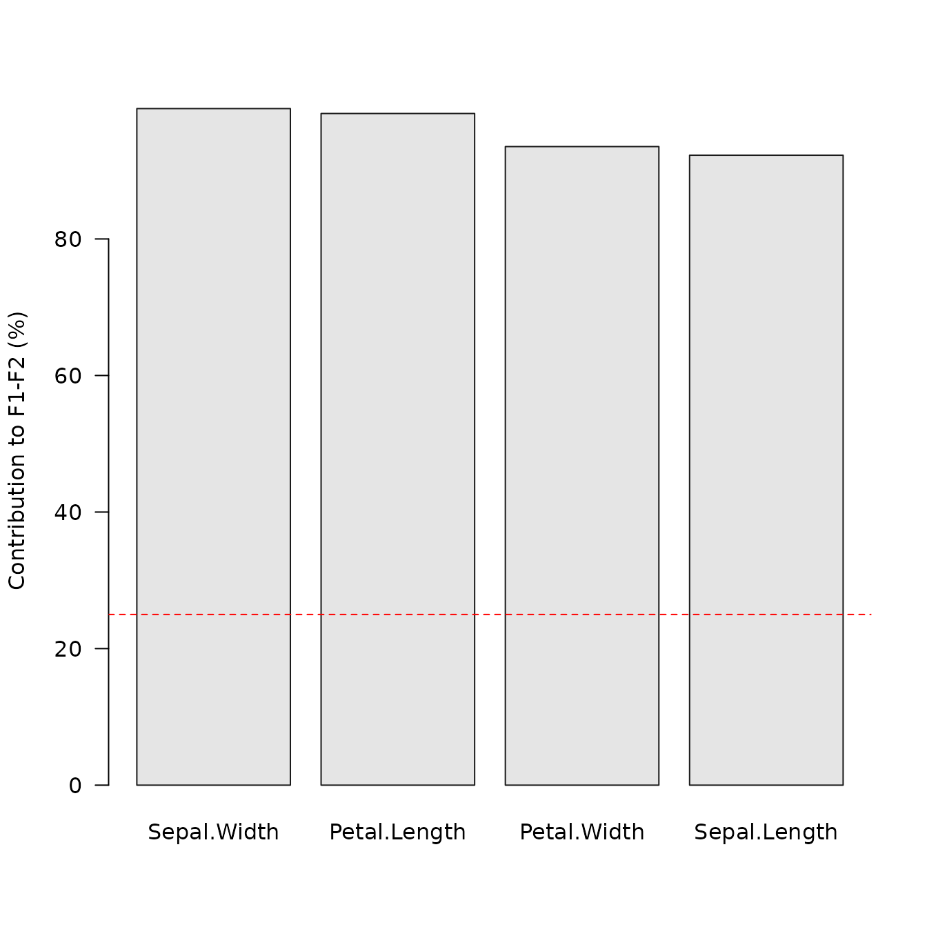
## Plot variable contributions to the definition of the first two axes
viz_contributions(X, margin = 2, axes = c(1, 2))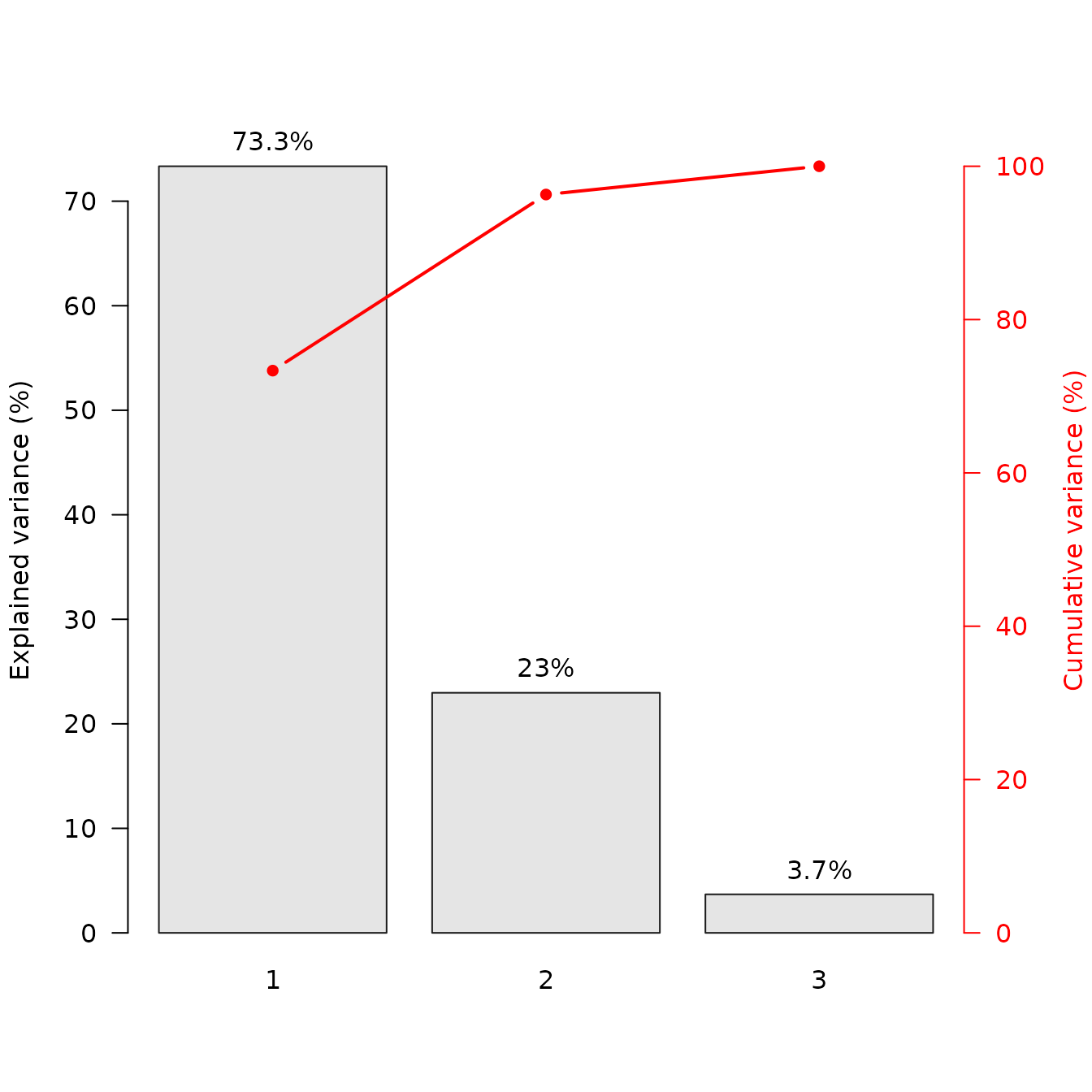
PCA biplot
A biplot is the simultaneous representation of rows and columns of a rectangular dataset. It is the generalization of a scatterplot to the case of mutlivariate data: it allows to visualize as much information as possible in a single graph (Greenacre, 2010).
dimensio allows to display two types of biplots: a form biplot (row-metric-preserving biplot) or a covariance biplot (column-metric-preserving biplot). See Greenacre (2010) for more details about biplots.
The form biplot favors the representation of the individuals: the distance between the individuals approximates the Euclidean distance between rows. In the form biplot the length of a vector approximates the quality of the representation of the variable.
biplot(X, type = "form", labels = "variables")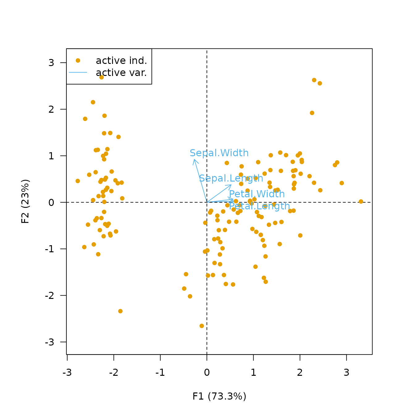
The covariance biplot favors the representation of the variables: the length of a vector approximates the standard deviation of the variable and the cosine of the angle formed by two vectors approximates the correlation between the two variables (Greenacre, 2010). In the covariance biplot the distance between the individuals approximates the Mahalanobis distance between rows.
biplot(X, type = "covariance", labels = "variables")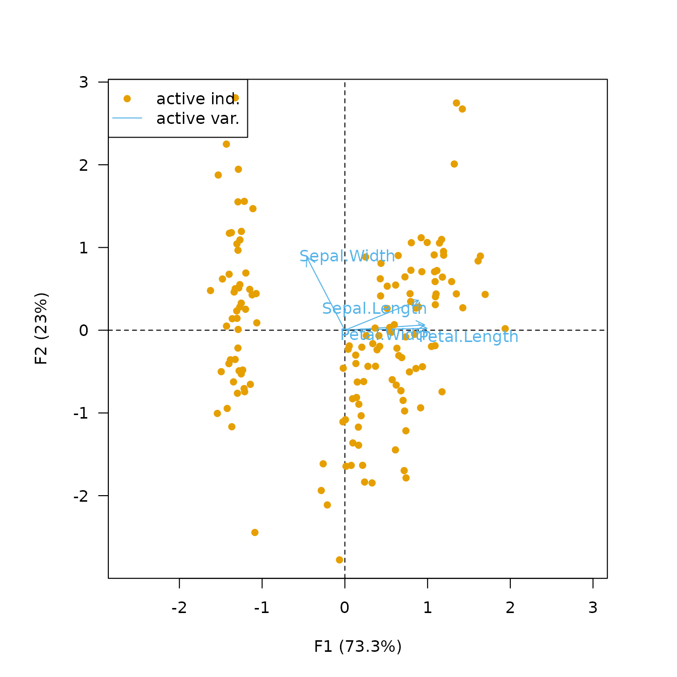
Biplots have the drawbacks of their advantages: they can quickly become difficult to read as they display a lot of information at once. It may then be preferable to visualize the results for individuals and variables separately.
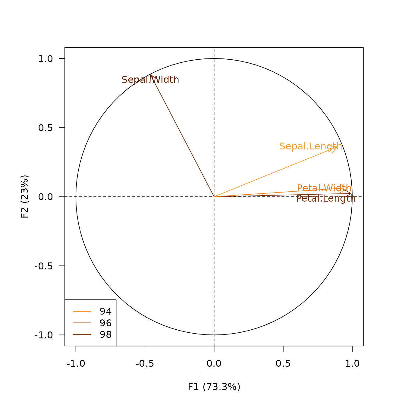
Plot PCA loadings
viz_variables() depicts the variables by rays emanating
from the origin (both their lengths and directions are important to the
interpretation).
## Plot variables factor map
viz_variables(X)
viz_variables() allows to highlight additional
information by varying different graphical elements (color,
transparency, shape and size of symbols…).
## Highlight contribution
viz_variables(
  x = X,
  extra_quanti = "contribution",
  color = c("#FB9A29", "#E1640E", "#AA3C03", "#662506"),
  legend = list(x = "bottomleft")
)
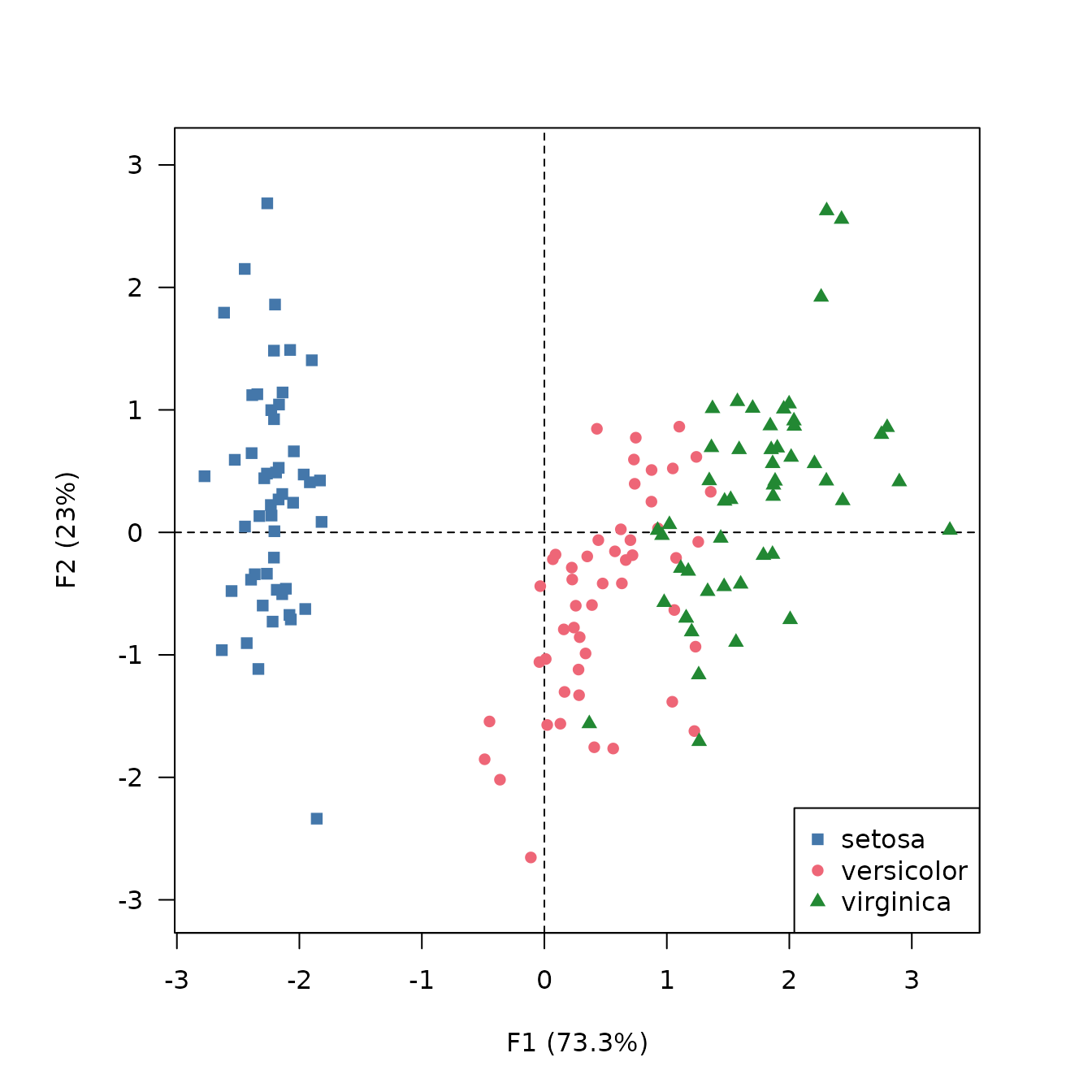
Plot PCA scores
viz_individuals() allows to display individuals and to
highlight additional information.
## Plot individuals and color by species
viz_individuals(
  x = X,
  extra_quali = iris$Species,
  color = c("#4477AA", "#EE6677", "#228833"), # Custom color scheme
  symbol = c(15, 16, 17), # Custom symbols
  legend = list(x = "bottomright")
)
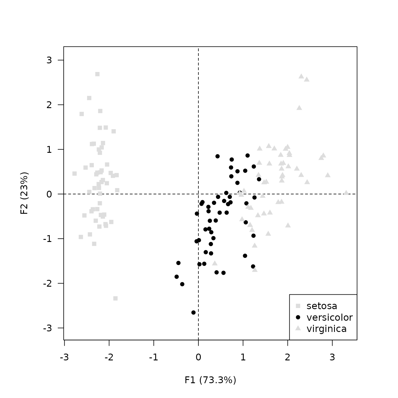
## Highlight one species
viz_individuals(
  x = X,
  extra_quali = iris$Species,
  color = c(versicolor = "black"), # Named vector
  symbol = c(15, 16, 17), # Custom symbols
  legend = list(x = "bottomright")
)
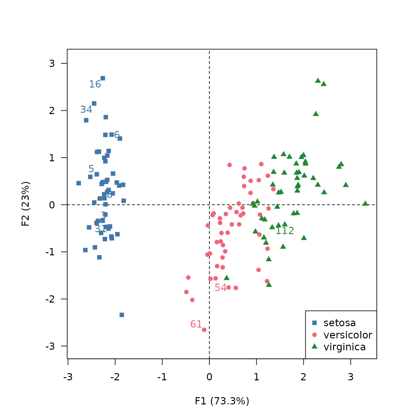
## Label the 10 individuals with highest cos2
viz_individuals(
  x = X,
  labels = list(filter = "cos2", n = 10),
  extra_quali = iris$Species,
  color = c("#4477AA", "#EE6677", "#228833"),
  symbol = c(15, 16, 17),
  legend = list(x = "bottomright")
)
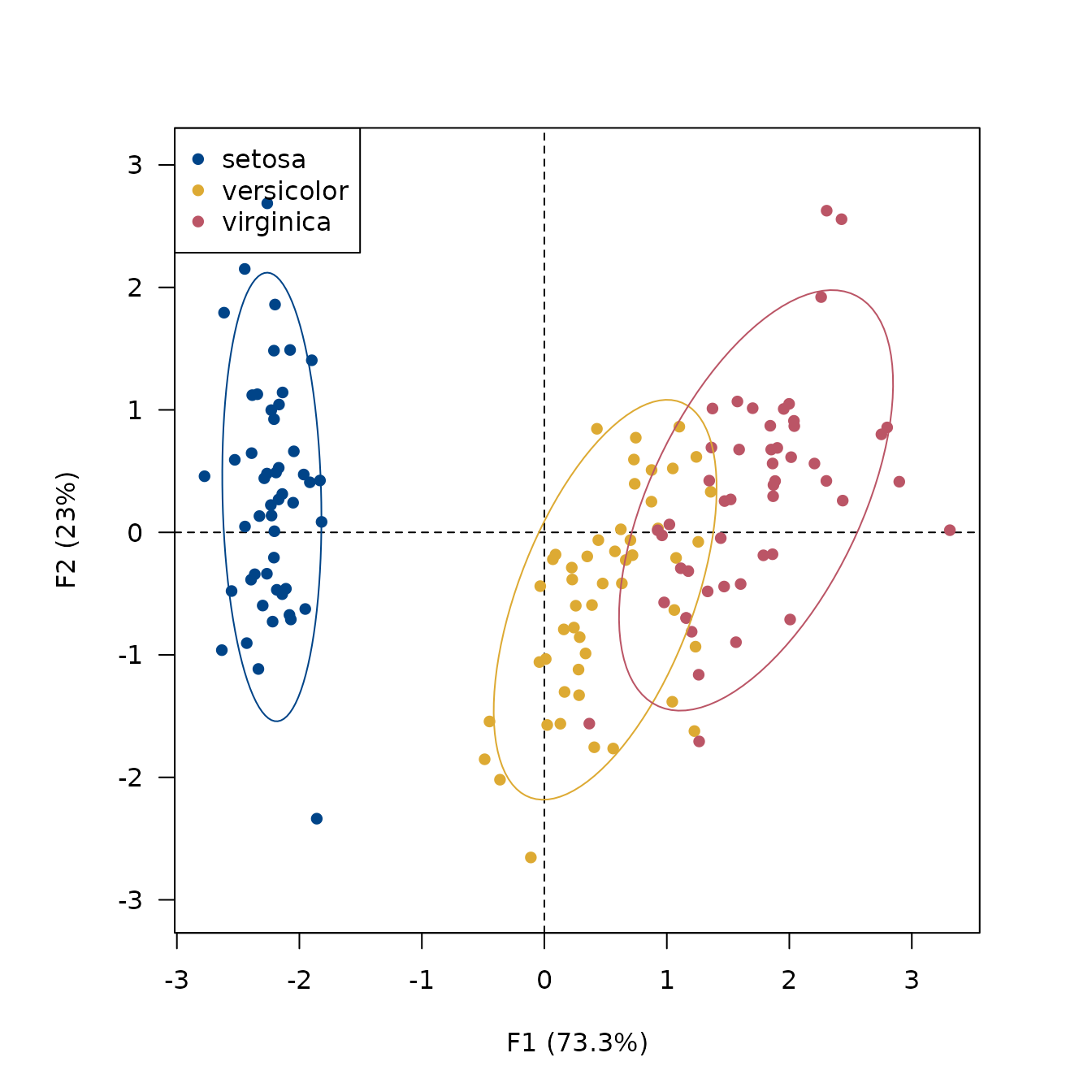
## Add ellipses
viz_individuals(
x = X,
extra_quali = iris$Species,
ellipse = list(type = "tolerance", level = 0.95),
color = c("#004488", "#DDAA33", "#BB5566")
)
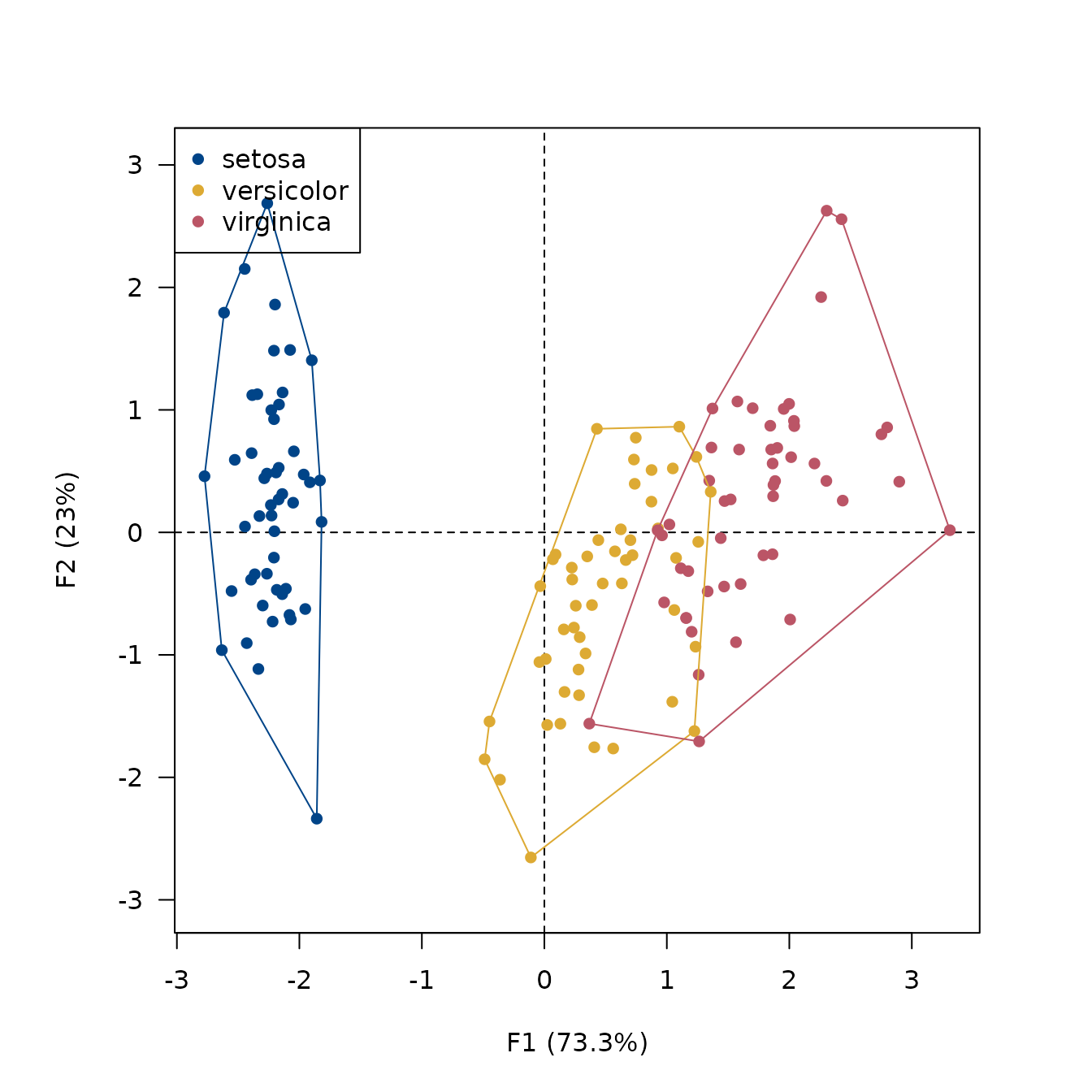
## Add convex hull
viz_individuals(
x = X,
extra_quali = iris$Species,
hull = TRUE,
color = c("#004488", "#DDAA33", "#BB5566")
)
## Highlight petal length
viz_individuals(
  x = X,
  extra_quanti = iris$Petal.Length,
  color = color("YlOrBr")(12), # Custom color scale
  size = c(1, 2), # Custom size scale
  legend = list(x = "bottomleft")
)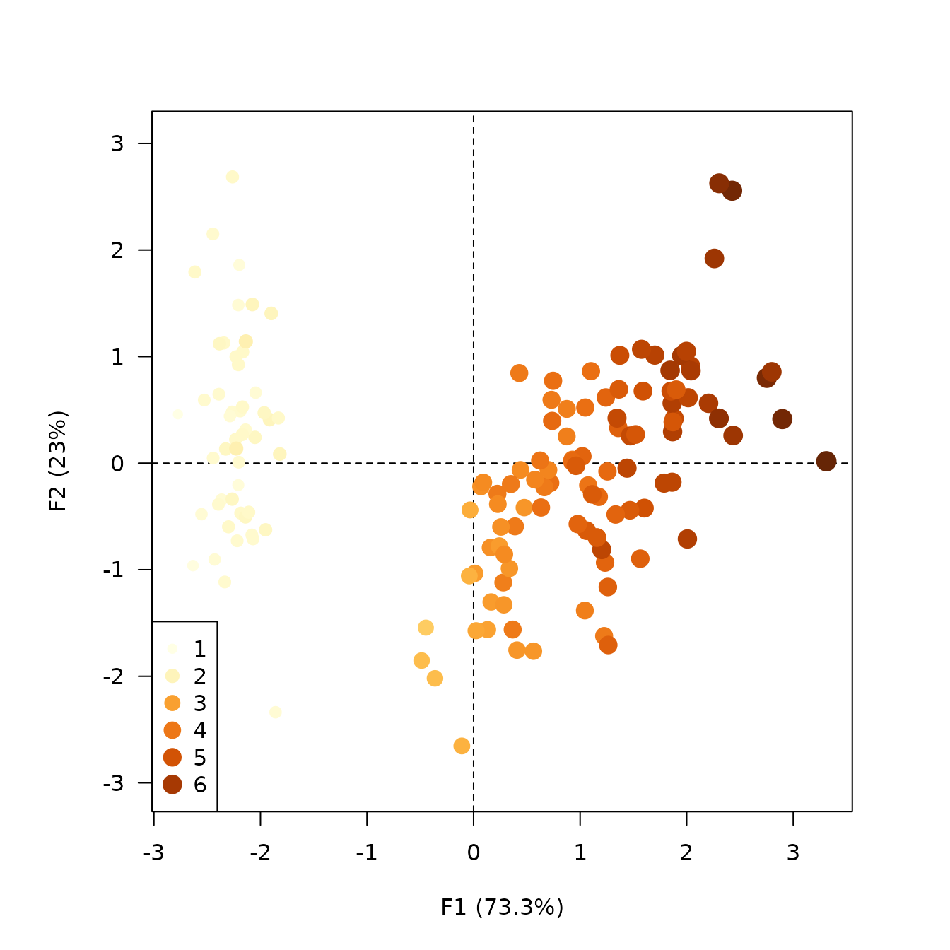
## Highlight contributions
viz_individuals(
  x = X,
  extra_quanti = "cos2",
  color = color("iridescent")(12), # Custom color scale
  size = c(1, 2), # Custom size scale
  legend = list(x = "bottomleft")
)
Custom plot
If you need more flexibility, the get_*() family and the
tidy() and augment() functions allow you to
extract the results as data frames and thus build custom graphs with
base graphics or ggplot2.
iris_tidy <- tidy(X, margin = 2)
head(iris_tidy)
#>          label component supplementary coordinate contribution        cos2
#> 1 Petal.Length        F1         FALSE 0.99155518  33.68793618 0.983181682
#> 2 Petal.Length        F2         FALSE 0.02341519   0.05998389 0.000548271
#> 3 Petal.Length        F3         FALSE 0.05444699   2.01999049 0.002964475
#> 4  Petal.Width        F1         FALSE 0.96497896  31.90629060 0.931184395
#> 5  Petal.Width        F2         FALSE 0.06399985   0.44812296 0.004095980
#> 6  Petal.Width        F3         FALSE 0.24298265  40.23019050 0.059040571

iris_augment <- augment(X, margin = 1)
head(iris_augment)
#>          F1         F2 label supplementary        mass      sum contribution
#> 1 -2.264703  0.4800266     1         FALSE 0.006666667 5.359304     3.572870
#> 2 -2.080961 -0.6741336     2         FALSE 0.006666667 4.784855     3.189904
#> 3 -2.364229 -0.3419080     3         FALSE 0.006666667 5.706480     3.804320
#> 4 -2.299384 -0.5973945     4         FALSE 0.006666667 5.644048     3.762699
#> 5 -2.389842  0.6468354     5         FALSE 0.006666667 6.129742     4.086494
#> 6 -2.075631  1.4891775     6         FALSE 0.006666667 6.525894     4.350596
#>        cos2
#> 1 0.9968578
#> 2 0.9864650
#> 3 0.9995167
#> 4 0.9977577
#> 5 0.9997491
#> 6 0.9998819
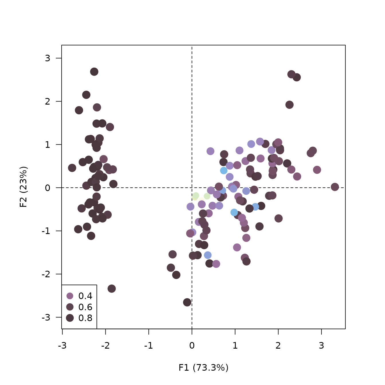
## Custom plot with ggplot2
ggplot2::ggplot(data = iris_augment) +
  ggplot2::aes(x = F1, y = F2, colour = contribution) +
  ggplot2::geom_vline(xintercept = 0, linewidth = 0.5, linetype = "dashed") +
  ggplot2::geom_hline(yintercept = 0, linewidth = 0.5, linetype = "dashed") +
  ggplot2::geom_point() +
  ggplot2::coord_fixed() + # /!\
  ggplot2::theme_bw() +
  khroma::scale_color_iridescent()